If you’re a tour or activity operator, you most likely have an ‘About’ page. It’s on every single website, and I think many people add an About page without actually considering its true purpose.
The most common question I get is: ‘What do we actually put there?’
It’s something that many of our clients struggle with – ‘What should I write? Do I need to put photos? What kind of photos?’ I touched on it in my book(opens in a new tab), but this post is designed to put those questions to bed and give you the resources you need to get this important page nailed down.
The First Question To Ask Yourself: Why Do People Visit an About Page?
Before you even sit down to write a word of this, you need to understand the visitor.
Why does someone visit an About page? Some may be potential employees, others out of pure curiosity and the rest because they’re not yet sold. Let’s leave the curious cats for a moment and focus just on that last group.
It’s so important that you get this understood. Think about it. If they’re not yet sold and they’re visiting your About page, it means they WANT to be sold but in the right way.
Boring information? No, sir. Give them a peek inside of the kimono.
In just a few words, you want to ‘keep it fun, keep it personal and demonstrate your credibility.’
Step 1: Get the tone right.
Shawn Graham, online marketing expert, has this to share(opens in a new tab): ‘Instead of treating it like a boring writing assignment, think about how you would tell your story to someone if you were speaking with them face-to-face.’
The idea is to make sure the content sounds conversational. You’re not writing a university admissions piece here – you’re sharing directly with another human being. Sure, multiple people will read this, but only one at a time. Look to connect with your reader.
Too many about pages start every single paragraph with ‘I’. ‘I’m this’ and ‘I’m that’. Your About page is about you, but it shouldn’t be self-centered. There is a difference.
Step 2: Show me who you are.
When I visit an About page, I’m not doing it to learn more about your brand. I’m looking to learn about the PEOPLE behind the brand.
This means that if you’re not showing me names photos of you, you’re really letting me down as a visitor. Going on a tour is an intensely personal thing – we get locked in a car for hours with someone we’ve never met before. I need to make sure you’re a normal human being.
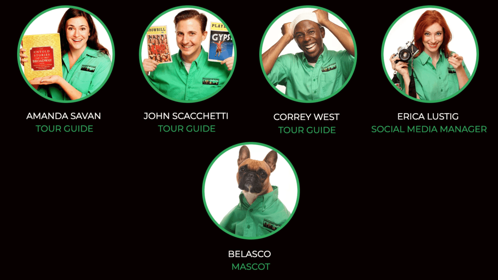
Just check out this amazing implementation from Broadway Up Close(opens in a new tab) in New York:

Each staff member has their own photos and profile, and they even have the team dog listed!
Show me who you are!
Step 3: Show us a bit of personality.
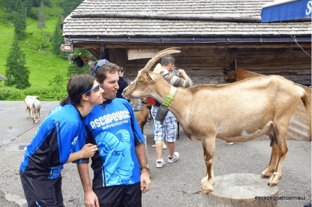
Who wants to go on a tour with a cardboard company? Show that you’re a fun person, and your potential visitors will have a lot of confidence that they’ll be able to have fun with you too. I love how our client Escapegoat(opens in a new tab) does this – right at the top of their about page(opens in a new tab) you’ll bump into this photo:

This photo shows us that they’re fun and know how to have a laugh and express a bit of humor.
Following this photo, Ian’s about profile opens with these words:
‘Ian finished University and tried to avoid getting a proper job. So he spent a lot of time traveling instead.’
This kind of thing makes me actually want to keep reading! It’s interesting and gives us the spark to learn more about him.
Step 4: Tell me your story.
Show us WHY you’re in this business. Tell us how it happened! Skip the dry facts (‘after graduating from the University of Columbus in 1999’), and show us your human side.
If you open up in an interesting way, it makes it much easier to get people to pay attention. Check this example out from Foodsofny.com(opens in a new tab), which leads with an inrresitible headline.
Keep it short and sweet, though. It’s easy to lose people’s attention here, leading to the next point:
Step 5: Don’t drone on too much.
The above is all true, up to a point. Keep your usage of words precise and clean because too many About pages turn into rambling text that bores quickly. Are you making this mistake?
After your first draft, I guarantee you’ll find things you can chop out or rephrase.
Step 6: Social Proof: Show us what other people think.
Social proof is a well-established principle of online marketing: OTHER people’s opinions of you. To take an interesting spin on it, it would be so cool if you have children for them to write a message about you as the owner. That would really grab people and show your human side.
If you don’t have a 10-year-old child handy – I’m in the same boat – think about who else can validate you and demonstrate that it’s not just YOU who thinks you’re amazing.
This is a great place to include:
- Media Mentions
- Testimonials
- Awards
- Memberships
- More photos but with you and your guests
Wrapping Up
Want me to look at yours? Get in touch! I’m happy to give feedback on your About page, but go through the above steps first to make sure we both get the best use out of my time.
Find this article useful? Enter your details below to receive your FREE copy of 95 Epic Places To List Your Tours and receive regular updates from TourismTiger and leading industry experts.
By submitting this form you agree to TourismTiger contacting you via email.
"*" indicates required fields