Click Me, Play Me, Book Now…sound familiar? That’s probably because these are three of the most common phrases found on activity and tour businesses’ websites. These words can also be very powerful. But it isn’t just the wording that is giving these nifty little phrases their power. Much like wannabe celebrities, website call-to-actions (CTAs) need to be in the right place at the right time.
If you aren’t familiar with the term ‘call-to-action’, CTAs do what they say on the tin: they attract (or ‘call’) website visitors’ attention to a certain element on your website, e.g. a button, and cause an ‘action’, e.g. clicking the button. And while they might seem like a trivial detail, an afterthought even – they are hugely important. Why?
Well, last year over 45% of people booked trips online – an increase of more than 10% in just four years. Which means that if you want to generate more sales, your online presence needs to be up to scratch.
But before you start luring people to your website, make sure your website is effective – and crafting CTAs that drive sales play a big role in that. In fact, an A/B test was done on one of Unbounce.com landing pages. They simply changed one word in the CTA and saw a 90% increase in the click-through-rate.
While this huge increase isn’t necessarily representative of most changes to CTAs, it does underscore how important it is to have a well-crafted CTA. So how exactly do you do that? Check out our hot tips below:
The secret formula to the perfect CTA
The ideal call to action drives a website visitor to complete an action which eventually creates a sale — for example, filling out a booking form. This sounds easy enough but can often be tricky to execute. If you Google ‘call to actions’, you will no doubt be inundated with a number of top tips, but it is often hard to narrow these down and make them relevant to activity and tour providers’ websites. To save you time, we have compiled a list of the top five best practices specifically for the tour and activity sector in 2016:
#1: If you’re looking to generate leads, provide compelling lead magnets (such as content upgrades) in exchange for viewers’ names and email addresses. If you’re wanting to create bookings, then using a seemingly simple ‘Book Now’ button is your best bet.
#2: Produce action-orientated content of two to five words that makes website users want to interact and fulfill your aim, e.g., ‘Book Now’.
#3: Consider where the CTAs are positioned on the website so there is a natural flow through your website. CTAs which appear above the fold perform higher than those that don’t. It’s also best to include ‘Book Now’ and ‘Contact Us’ buttons on your website’s top navigation bar, so no matter where your website visitors are, they can quickly book an activity or contact your team.
Pro-tip: If you are unsure of your website’s natural flow, check out hotjar.com. They provide heat maps and screen recording sessions – for free!
#4: Make sure that the colour of your CTA is contrasting to the website or navigation’s background that it sits on without detracting from the website’s design. Also, make sure you keep the CTA large enough to be seen from a distance but not so large that it’s going to distract website visitors from the rest of the website.
#5: Make your instruction clear and simple, and don’t promise something that the customer won’t actually get. If you’re saying ‘Book Now for Free’ but then charge a card fee, the booking isn’t technically free, and it could lead to disgruntled customers.
Tracking your website’s success
Once you have setup your call to actions, you will want to track how well they are performing. The easiest way to track CTAs is through Google Analytics.
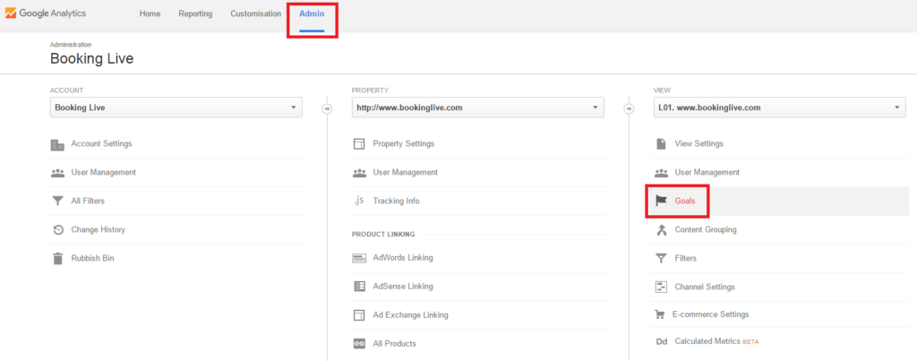
CTA tracking can be setup in the form of goals. To do this, login to your Google Analytics account and head to the Admin section (found on your menu bar). Once inside, click on ‘Goals’.

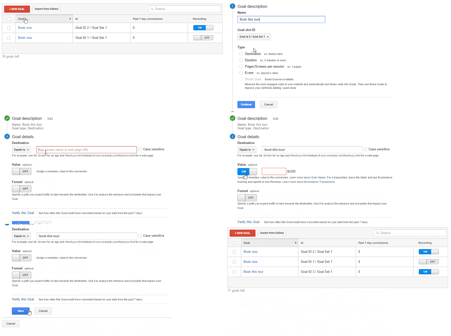
This will bring you to your Goals dashboard, where you will notice a ‘New Goal’ button in red – click on this. Initially you’ll be prompted to tell Google what kind of goal you want them to track, i.e., a destination, duration, pages/screens per session, or event. While all of these types of goals are relevant and worthy of tracking, you’ll want to choose ‘destination’, as you are tracking how many people are reaching a given page – in this case, the given page will be where the viewer is directed to once they click on the CTA that you are testing.
After you’ve named your goal and chosen its type, Google will need some more information from you, namely the web page URL that you are directing people to (when entering the URL, ensure that you only include what comes after the backslash).
They also allow you to track optional elements, such as any kind of financial gain associated with clicking on the CTA and the efficacy of your funnel – entrance and exit points (URLs) associated with the CTA.

Want to make your CTAs even more effective?
With all of these tips, you should be well on your way to improving click-through-rates on your CTAs. However, the key now is to make sure that they are clicking on something relevant – and if you are selling tours, you want to ensure that you integrate your ‘Book Now’ CTAs with online booking software. This will enable you to increase tour sales and ultimately increase your bottom line.
Find this article useful? Enter your details below to receive your FREE copy of 95 Epic Places To List Your Tours and receive regular updates from TourismTiger and leading industry experts.
By submitting this form you agree to TourismTiger contacting you via email.
"*" indicates required fields