You’ve gotten your website set up with your tours, beautiful photos, and of course, booking links from your software of choice. When you scroll through your site on your computer, it looks great, it’s easy to use, and you wouldn’t trade it for the world. But then, when you’re caught out on a tour and you navigate to your site on your smartphone, your stomach drops. Everything is tiny and unreadable! You can’t see the photos or your menu very well, you have to desperately try to pinch to zoom in to read your content, and your thumbs are too big to tap on tiny links. What happened?(opens in a new tab)
Unfortunately, this means that your site isn’t designed for mobile. Sites that are responsive to mobile devices are able to recognize that they are being accessed on a handheld device (e.g., smartphone, tablet), and alter the layout of the site accordingly. This makes a website far easier to interact with when looking at it on your smartphone. It’s important to note that there are a few ways a site can be optimized for mobile… all with different names, of course. I promise it’s not to confuse you!
1. Mobile-friendly websites
According to the folks at SignalFire(opens in a new tab), a mobile-friendly website is one that simply adjusts its size to fit your screen without changing the layout that you’ll see on desktop. A good mobile-friendly site will also:
- Allow contact information like phone numbers and emails to be clickable (or tappable)
- Have small images so that even a weak mobile connection can load them
- Not require Flash when it comes to rotating images (since many mobile devices don’t support Flash)
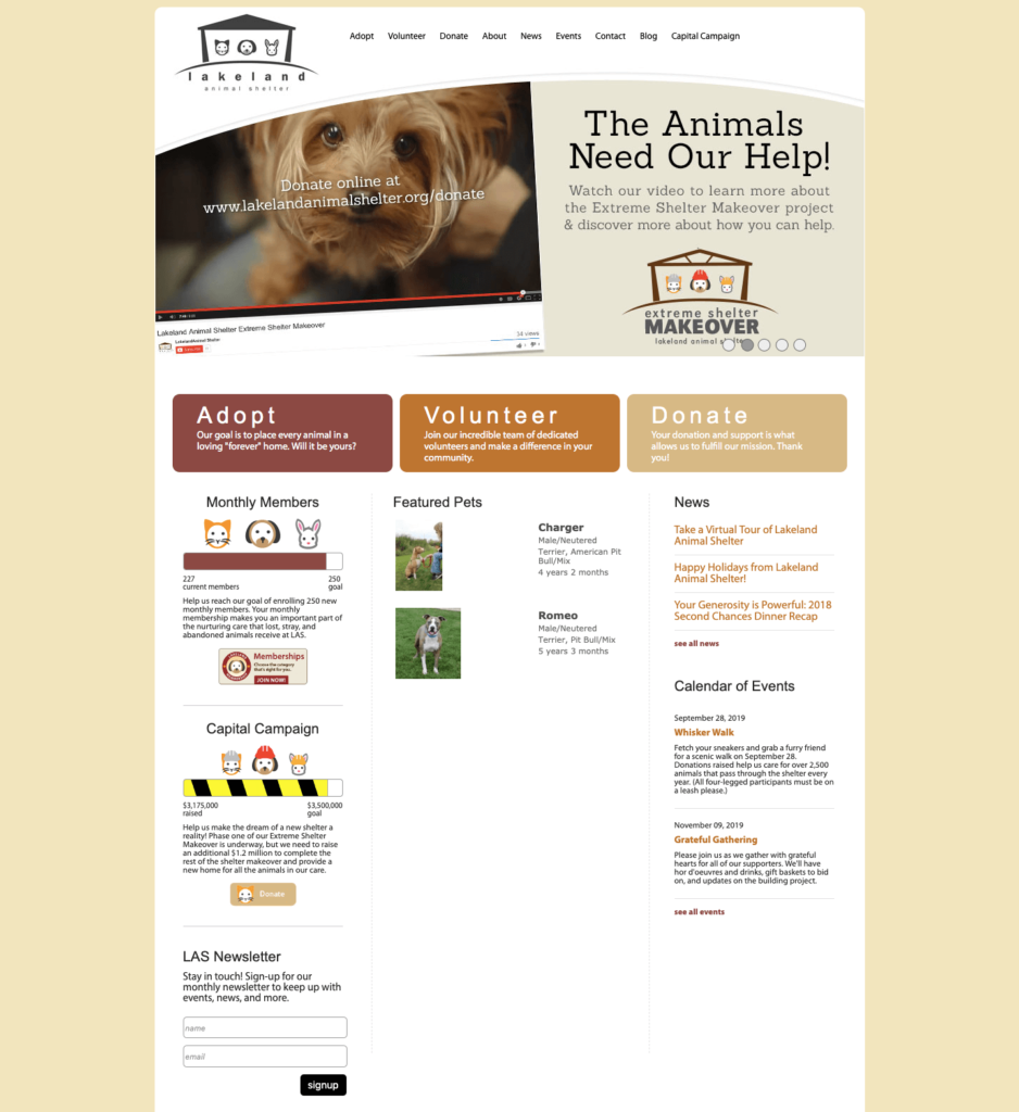
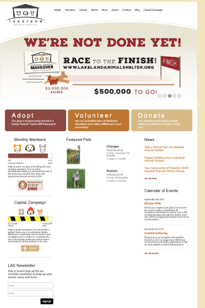
2. Mobile-optimized websites
A mobile-optimized site is a step above mobile-friendly. Rather than just adjusting size, a site with these capabilities will reformat itself to suit the handheld device it’s being viewed on. Some of the distinct perks of mobile-optimized design are larger navigation buttons, content formatted to fit your screen, and images that automatically resize. This sort of design goes above and beyond for the mobile user — everything is that much easier, encouraging them to stay on the site and even make a purchase. Some good elements that a mobile-optimized site offers are:
- A clear option to visit the desktop (or “complete”) version of a website
- Reduced graphics so as to not disrupt the navigation experience
- Easier navigation with larger buttons and links for the thumbs
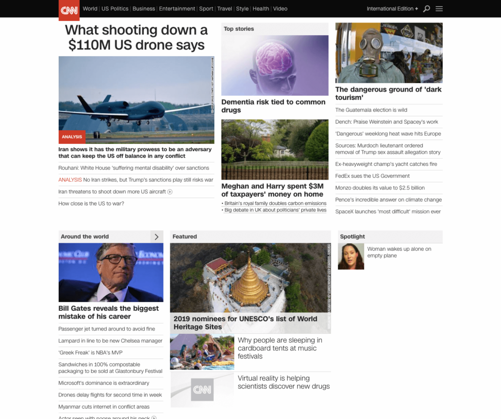

3. Responsive design websites
A responsive design is the best way to go if you have products for purchase online and potential customers are likely to access your website through their smartphones or tablets. Though it’s the most costly option development-wise, this gives your website(opens in a new tab) the greatest flexibility, and therefore, the greatest potential. To better describe how it works, I’ve provided some images below.
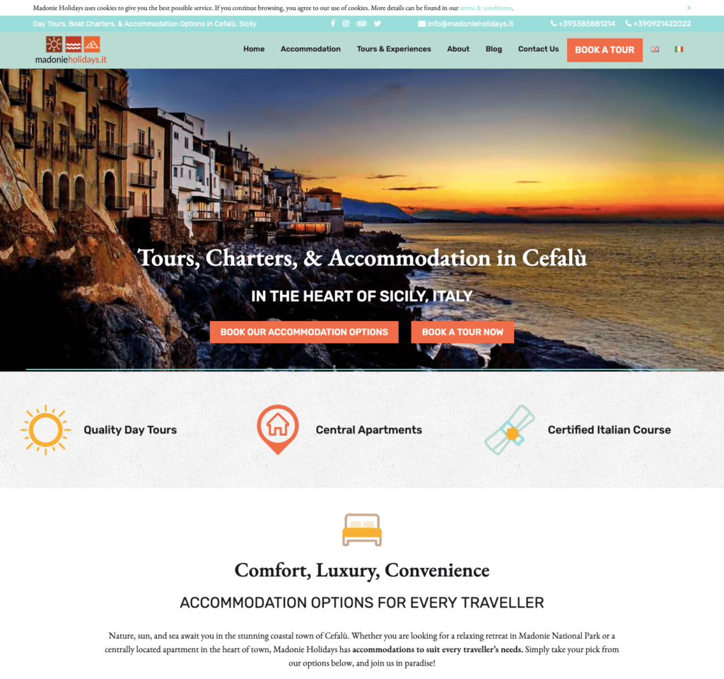
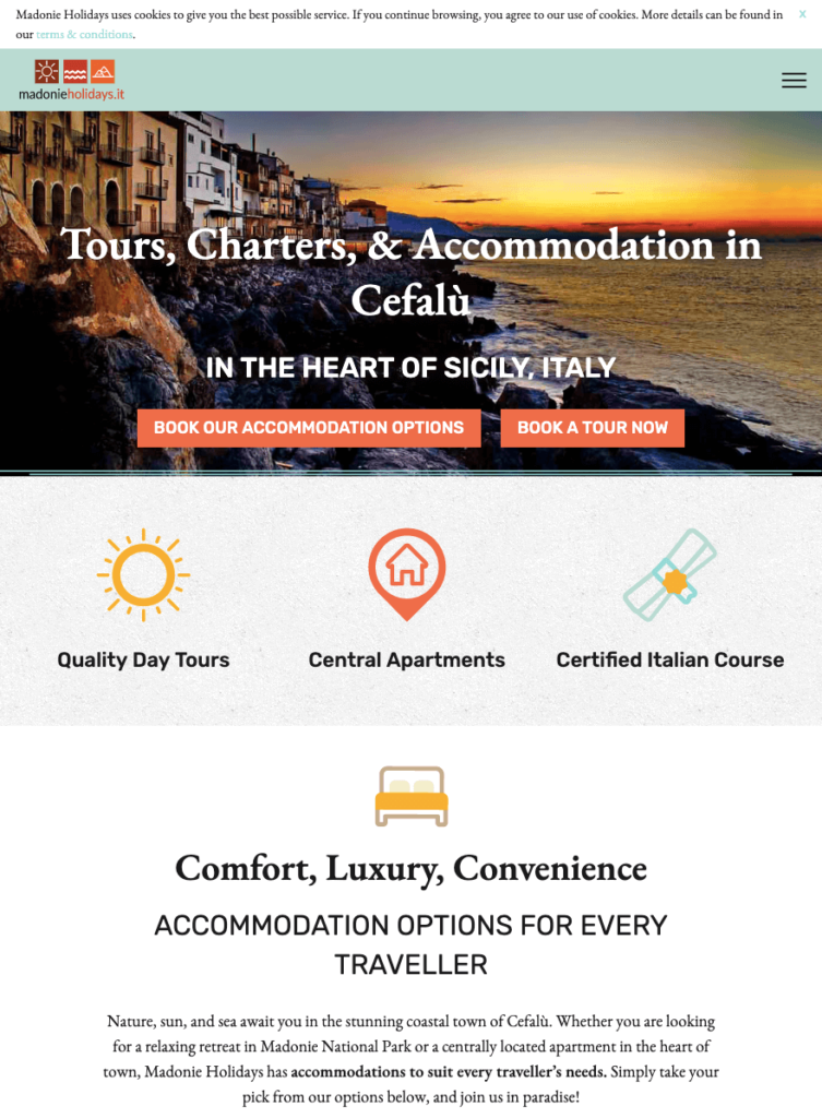

Here at Tourism Tiger, we are proud to offer websites with responsive design — we know how often people look up things to do or tours to take on their phones! If you’re looking to make the switch from your out-of-date, not-mobile-friendly website, just get in touch with us today and let’s chat about how we can give you a hand.
Find this article useful? Enter your details below to receive your FREE copy of 95 Epic Places To List Your Tours and receive regular updates from Tourism Tiger and leading industry experts.
By submitting this form, you agree to Tourism Tiger contacting you via email.
"*" indicates required fields