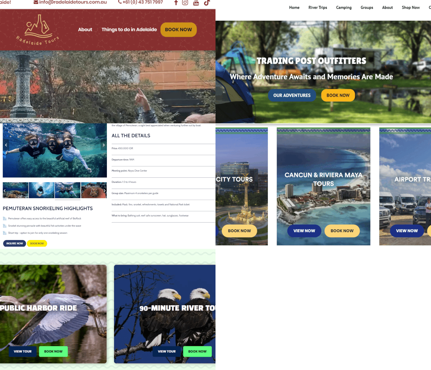
When it comes to increasing conversions on your site, few things are as important as the booking button. Yet, on many tour operator websites, it’s often one of the most neglected elements. Why? For many, the booking button – the most critical feature on your entire site – is an afterthought. If you need help making your booking button stand out on a stunning website, contact us today!
First Things First: You Do Have a Booking Button, Right?
It’s surprising how many tour and activity operators still don’t have a prominent booking button. If you want every booking possible, make it easy for customers to choose you. The golden rule of selling applies here:
Don’t Make People Work to Buy from You
Most internet browsing is distracting. People could be multitasking – working, watching TV, or even playing with their kids. This means your website should guide them effortlessly through the process. Every step should be obvious enough for anyone to use, no matter how unfamiliar they are with your site. So, ensure your booking button is clear and prominent.

The Booking Button: 5 Tips to Stand Out
Here are a few key tips to make your booking button unmissable:
- Make it obvious. Your booking button should be the most identifiable part of the page. If someone were to glance at the page, even without their glasses, they should still spot it immediately.
- Use contrasting color. The button should stand out, with a color that contrasts with the rest of the page. Don’t worry about finding the “perfect” color – just make sure it’s distinct. As experts like Julia from Xola recommend: “The color of your CTA must stand out from your background.” Our branding package can create a color guide for you and make it ADA compliant at the same time! You can also surround the button with whitespace or use design elements that make it impossible to ignore.
- Use clear imperatives like “Book Now”. People need clear guidance on what to do next. Phrases like “Book Now” work much better than “Bookings and Inquiries” because they create a direct action.
- Write in the first person. Phrases like “Book My Tour” tend to convert better than “Book Your Tour.” Tests show that using “my” instead of “your” feels more personal to users.
- Create urgency. Phrases like “Book Now” encourage immediate action.
Trick Two: Sticky Booking Buttons
Two Additional Tricks to Close More Bookings
Trick One: Use Click Triggers
Click triggers are little reminders next to your booking button that address last-minute concerns. Use two types:
- FOMO triggers: “Hurry, spots are limited!” or “Tours book fast!”
- Confidence triggers: “100% Satisfaction Guaranteed” or “5-Star Rated on TripAdvisor.”
Make your booking button follow visitors as they scroll. This ensures the button is always visible, especially on mobile, where it can remain at the top or bottom of the screen for easy access. This small tweak won’t double your sales, but it will help increase conversions by consistently keeping the booking option in sight.
A well-designed booking button can significantly boost your conversion rates. By making it clear, contrasting, and actionable, while incorporating urgency and confidence triggers, you’ll guide visitors effortlessly through the booking process. Don’t overlook this crucial element – small changes can lead to big results in securing more bookings.
Find this article useful? Enter your details below to receive your FREE copy of 95 Epic Places To List Your Tours and receive regular updates from Tourism Tiger and leading industry experts.
By submitting this form you agree to Tourism Tiger contacting you via email.
"*" indicates required fields